If your website is getting a lot of traffic but you’re not seeing the conversions you’ve been hoping for, your website navigation might be to blame.
Have you ever eaten at a restaurant that had just a really bad menu? Maybe there was too much information, or not nearly enough to understand what you’d actually be ordering. Whatever the case, it created confusion that affected your experience.
Your website’s navigation acts in much the same way. From your menus to CTA’s and banners, how you structure and present this information has a huge impact on how potential customers view your organization.
Here are a few website navigation best practices to consider as you update your site to improve conversions.
Step 1: Diagnose the Problem
Before you overhaul your website navigation, it’s important to first take a moment to determine what your audience is actually looking for and what you need to do to make it easier for them to find it.
To begin with, get user reviews from audiences similar to your customer profile. Conduct surveys and, if possible, in-person reviews to obtain this information.
Look inward too — does your organization receive requests for a service or section of your website that is available, just hard to find? Poll anyone in a customer service position and get their feedback.
Next, open up your current analytics and review the data. Are there pages that are viewed more often than others? Do you have key services or pages that rank lower than you’d expect, despite being central to your business? If you see users landing on your homepage then quickly dropping off, this is a sign that your navigation to these pages might be flawed and you need to make some changes.
Step 2: Review the Competition
In most cases, your website should also follow a similar format to others in your industry, providing of course that these other websites are following the best practices outlined throughout this post. For example, you expect a clothing manufacturer’s website to have images of products to flip through.
It’s never a bad thing to take a look at your competitors and see if there’s one thing they’re all doing within their website navigation that appears worth replicating — or better yet, improving on.
Step 3: Define Your User Flow
Now is the time to review and define your intended user flow. A user flow outlines the steps it takes to complete a specific action on your website, like first coming across your website to downloading a content offer, for example.
Essentially, you’ll want to map out all the actions a user can take on your site and then analyze it to see if areas can be streamlined or cleaned up. You want to be directing users to your intended results without running into any unnecessary speedbumps. If you notice users dropping off at a specific step in the flow, then that’s a sign it’s time to address that step. Take a look at this post for a more detailed look at how to create your own user flow diagram.
Step 4: Simplify
I’m going to go out on a limb and say that you too have encountered a website with way too many menu options. For a while, it was kind of popular to just throw everything an organization does on the homepage or squeeze it all into never-ending dropdown menu after dropdown menu.
While this method may stress upon your viewers that you can do a lot, it is also completely overwhelming. And if you claim to be good at too many things, it becomes hard to believe that you’re great at any of them. As the saying goes, less is more.
After taking a look at your analytics, you’ll likely see that most of your underperforming tabs or menus can be combined into one overall page or even left off your website entirely — not all information is as essential to your prospect’s decision-making process as you might think, and you can instead incorporate this information into your content marketing, or if it makes more sense, bring it up at the appropriate time later in sales process.
Ensure your navigation is as uncluttered as possible. Some key guidelines to follow include:
- Have five to seven navigation tabs; any more is excess and any less makes it seem like your business lacks expertise
- In a drop-down menu bar, put your most important links at the beginning and end of the list — these are the locations proven to be the most memorable for viewers
- Always link your logo back to your homepage for easy access
This also comes into play when structuring your sites for mobile usage. Dropdown boxes can be difficult to operate on mobile, so you’ll want to ensure your relevant CTA’s are large enough to click on them — or you could even avoid dropdowns entirely. If this is a key function of your site, then consider replacing the classic three-line, “hamburger” menu button, shown here:

With the word “Menu.” While it doesn’t look quite as appealing, studies have shown that hidden UX like this actually hurts navigation.
Keep this in mind for all aspects of your mobile navigation design. While it may take extra time and effort to design your mobile site, mobile has long since become most people’s preferred or common method of accessing the internet. Having a site which causes users to spend time figuring out your navigation, grow frustrated and potentially go somewhere else is inexcusable.
Step 5: Always Use Actionable Language
If you’ve ever redesigned a website or built one from the ground up, you know how oddly difficult it can be to actually name your menus or navigation buttons. After approving wireframes, settling on a design pallet, writing web copy and creating new content, labeling can seem also like an afterthought.
This is a mistake. Put yourself in your audience’s shoes. Sure, they expect your site to be clean and nice looking, but they also expect to easily find what they’re looking for. While menu structuring plays a huge role in this (discussed below), the language you use can also directly impact who clicks where.
Try to use actionable language which directly propels your viewers toward a goal — in short, don’t be passive — give them something to do.
A good example of this would be having a menu action like:
“Who We Are”
Vs:
“How it Works”
The latter is much more engaging and speaks to what your audience is likely actively seeking out. While background on your business is always good to have, this information can be worked into page copy rather than serving as a full biographical page.
Of course, there are exceptions here, depending on the nature of your organization and the services you provide. It might make more sense your navigation tools on each page to be more simplified — just take a look at our menu above. Even then, however, you’ll still want to use actionable language within the other navigation tools on your site.
Here’s a CTA on our homepage:
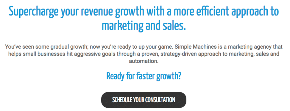
You’ll notice that the blue bolded text is full of action and vibrancy and the CTA button itself provides a direct actionable step.
Step 6: Put the Audience First and Review Analytics
In all aspects of your website navigation, you need to put your customers’ needs first. This may mean taking a step back and honestly taking a look at your organization, seeing it the way they do. What are they coming to you for? What do they expect to find right away?
This needs to be your code. Once you’ve made updates, continue to check your analytics to see if you notice improvements. If engagement goes up, then congratulations, you’ve made some successful enhancements. If not, then start back at square one and isolate which navigation steps still don’t seem to be working for your users.
If you think audience first and structure your navigation accordingly, you should see your conversions catch back up with your expectations.
Think your website is holding YOU back? Check out our Website Design Services and see how Simple Machines Marketing can help!