Here's a scenario many of us are familiar with.
You've been running a multi-channel ABM campaign with several different assets — marketing emails, prospecting emails, blog posts, white papers, webinars, paid ads, social media, etc.
You've got the campaign reports showing all kinds of activity: impressions, website visits, click-through rates, cost per click, new leads, cost per lead and so on. If you're using HubSpot, you may even have campaign reporting to show influenced contacts, attributed revenue and other types of attribution reporting.
Seeing all this activity is nice, but you can't help but wonder: is our marketing actually moving the needle with our target accounts? And could we get the same or even more traction if we rely solely on BDRs?
To answer these questions, a tool that should be in your toolbox is lift analysis reporting. With the right lift analysis reports, you don't have to guess whether the activities are truly impacting metrics that align with revenue goals, like deal size and close rate because it can be measured.
In this post, we'll walk through how to create lift analysis reports in HubSpot so you can begin putting this tool to work.
What Is Lift Analysis?
Picture two groups of people: one that has been exposed to your campaign assets and another that hasn't. A lift analysis evaluates how much more likely the exposed group is to take a desired action or lead to a certain result — whether that's visiting your site, booking a demo or converting at a higher percentage. It uncovers the boost, or "lift," your campaign delivered to key metrics, offering a clearer view of its true impact.
What are the Benefits of Lift Analysis?
When done correctly, there are a few key benefits of lift analysis:
- Identifies the true impact of campaigns on revenue and pipeline.
- Helps align marketing and sales teams on shared performance metrics.
- Moves away from vanity metrics and focuses on business impact.
Another way to think about it is that it avoids having to wonder about the counterfactual above ("Could we have achieved the same results with just BDRs?") by assessing this through comparison against a control group (the contacts that didn't see your marketing).
Preparing for Lift Analysis Reporting in HubSpot
Step 1: Define Your Objectives
Start by clearly identifying what you aim to measure through your lift analysis. The key is to align your objectives with meaningful business outcomes, ensuring that your efforts are tied to revenue impact rather than vanity metrics.
Here are a few examples of objectives you might focus on:
- Revenue lift – Assess the increase in revenue tied directly to your campaign efforts.
- MQL to SQL conversion rates – Measure whether marketing activities are improving the handoff and quality of leads passed to sales.
- Average deal size – Track the impact of your campaigns on average revenue per deal.
Once you know your objective, set specific timeframes to measure impact. This often involves comparing performance during two periods — e.g. before and after a campaign. Define which campaigns or channels you want to analyze for better insight into their performance.
Example objective:
"Measure the lift in MQL conversion to SQL after launching a targeted LinkedIn campaign." This helps frame what you're tracking and allows you to quantify success with specific metrics over the designated time frame.
Step 2: Set Up Your Tracking System
A well-structured tracking system ensures you capture the right data and link it to the desired outcomes — whether that's revenue lift, lead generation or improved conversion rates.
The way you set up your tracking system depends entirely on the objectives you've defined and what's already in place.
If you aim to track specific touchpoints or measure campaign influence, make sure your tracking aligns with those goals. This could involve setting up custom tracking URLs, UTM parameters or conversion events in HubSpot. Additionally, ensure you are logging all relevant interactions (e.g. form submission, deals created, etc.) so the data flows smoothly into your reports.
Example Tracking Setup in HubSpot
In one of our campaigns, we used engagement score bands to track how contacts interacted with campaign assets. Similar to a traditional lead score property, each contact was assigned a value based on the number of times they engaged with campaign assets. Then, when a deal was created, we used a workflow to total up the engagement scores of the associated contacts and then assign them to a corresponding engagement score band on the deal level.
![]()
This is by no means the only way to set up this kind of tracking, but for our purposes, this enabled the lift analysis reports we needed. Which takes us to…
How to Create Lift Analysis Reports in HubSpot
Step 1: Create a Custom Report in HubSpot
- Navigate to Reports > Reports Home and click Create Custom Report.
- Choose the appropriate report type:
- Use a Single Object Report to track performance across leads, deals, or campaigns.
- Use a Funnel Report to measure how contacts progress through lifecycle stages (e.g., MQL to SQL).
Step 2: Define Your Comparison Groups
- Exposure Group: Contacts who interacted with campaign assets (e.g., clicked an email, submitted a form, or visited a landing page).
- Non-Exposure Group: Contacts who did not engage with any campaign materials.
- Alternatively, you can create groups by different levels of engagement (e.g., high, medium, and low based on interaction frequency).
Example Comparison Setup:
- Group 1: Contacts who engaged with a LinkedIn ad or downloaded an eBook.
- Group 2: Contacts in the same target segment but did not engage with any campaign assets.
This approach lets you see whether campaign exposure correlates with higher conversions, pipeline growth, or deal closures.
Step 3: Add Key Metrics and Filters
- Choose metrics that align with your objectives, such as:
- SQLs generated
- Conversion rates (e.g., lead-to-customer)
- Revenue from deals attributed to the campaign
- Apply filters by lifecycle stage, campaign name, or source to ensure the data is segmented properly.
Step 4: Select Timeframes and Visualize the Data
- Set the time range for the report to match the duration of your campaign or sales cycle.
- Create visual comparisons between groups to identify trends, such as:
- A bar chart comparing SQLs generated by exposed and non-exposed groups.
- A line graph tracking revenue trends for each group over time.
This group-based reporting gives you deeper insights by showing not just what happened after the campaign but how different levels of exposure affected key outcomes.
Examples of Lift Analysis Reports
To understand the value of lift analysis, it helps to see it in action.
These examples are reports we created for a client that had the same questions posed at the beginning of this article, and they used the engagement score band tracking covered earlier. The objective was to understand how exposure to campaign assets impacted average revenue per deal and deal win rate, with the additional context of total closed won revenue by segment.
Example 1: Lift analysis – Average Deal Amount by Band
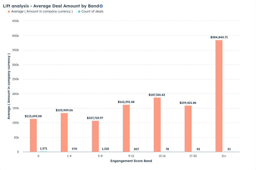
This report shows how average deal size is impacted by the amount of engagement associated contacts have had with campaign assets.
The X-axis breaks down the average size of the deal by engagement score band, starting with zero engagement on the left all the way to high engagement on the right. We also included the count of deals in each segment for context.
This report gives us some good insights, namely that more engagement does generally correlate with a bigger average deal size. Clearly, there's a big lift with the most engaged prospects, but you can also see where there are big opportunities to grow revenue elsewhere. For example, the majority of deals are in the 0 band or the 5-8 band, which have the lowest average sizes. This data suggests that making a concerted push to move the 0's to 1-4 and the 5-8's to 9-12 could net a significant revenue boost.
Example 2: Lift analysis- Win Rate by Band

Along with average deal size, we were also keen to see how engagement correlated with win rate. The report shows that the average win rate (blue) sees a significant uptick starting in the 13-16 band and continues with each band from there.
In combination, these two reports make a very compelling case: when contacts are more engaged with campaign assets, their average deal size tends to be bigger and the win rate tends to be higher.
Back to our question: is any of this actually moving the needle? Now we have an answer: yes!
How Lift Analysis Reports Drive Smarter Decision-Making
Lift analysis reports go beyond surface-level metrics, helping B2B sales and marketing leaders align efforts with outcomes that matter most—like revenue growth, lead quality, and conversion rates. By comparing different groups (such as campaign-exposed vs. non-exposed) or timeframes, these reports reveal which campaigns, channels, or assets truly move the needle.
This insight empowers teams to:
- Allocate resources effectively: Focus budget and energy on campaigns that deliver the highest lift, while scaling back on underperforming efforts.
- Optimize lead nurturing and follow-ups: Identify which touchpoints drive meaningful engagement, helping sales teams prioritize high-value prospects.
- Improve cross-functional alignment: Provide a clear view of how marketing impacts the sales pipeline, fostering collaboration and trust between teams.
- Refine future strategies: Use data from lift reports to test new ideas and continuously optimize campaigns for better results.
By measuring incremental impact, lift analysis ensures your decisions are backed by data, making your marketing and sales operations more precise and impactful.
Getting Started with Lift Analysis Reporting
Getting started with lift analysis may seem complex, but it becomes easier as you refine your objectives and tracking processes. Over time, these reports can become a crucial tool for understanding the true impact of your efforts — and driving smarter decisions for long-term success.
Need a hand to create lift analysis reports? We're happy to help.