Your website layout and the road have a lot in common. (I promise this isn’t a setup for a bad “information super highway” joke.)
Think back to the last time you were driving. You knew how fast to drive thanks to signs indicating the speed limit. You knew when to turn thanks to clearly marked turn signals. You even knew where to slow down for pedestrians thanks to signs and markings on the street.
You probably didn’t need to put much effort into figuring out the speed, where you were allowed to turn, or where to watch out for people crossing the street. The ease of driving is intentionally designed into our streets.
As you design your website layout, take a cue from street planners: a visitor on your website should be able to “drive” around your site and find what they are looking for easily and effortlessly.
To get your customers to the information they want on your website, you need to, well, know what they actually want.
The most important part of creating a website layout that moves people toward the information they want isn’t great code or beautiful images (although we like those a lot!).
In fact, the key to creating a website that actually gets people to the information they want doesn’t have anything to do with building websites at all. To design a website with great flow, you have to know what your visitors’ destinations are. That is, what does someone who goes to your site want to know?
Let me pause here to make a really important note: what you think your customers want to know isn’t necessarily the same as what your customers actually want to know. What you think your customers want is often just what you hope they want. Lots of people have incorrect assumptions about what their customers want, and that’s ok – if you learn what they actually are looking for and then update your marketing accordingly. (Read: admit you’re wrong and move on!).
Thankfully, there are ways to find out what your website visitors want. The first step you should take is to find what pages people frequent on your current website (this can be done with Google Analytics). However, if your site architecture isn’t so great right now, visitors may end up on pages that don’t give them what they want and leave before they find out the info they’re searching for. Because of this, you may need to dig a bit deeper to understand if the pages your visitors are going to are delivering the information they are trying to find.
One way to investigate this is by using behavior flow, a powerful tool within Google Analytics that tracks the flow of (you guessed it) behaviors visitors take, allowing you to see the path that they take from page to page across your site. Another way to track user behavior on your website is through heat maps that track visitors mouse or eye movements to see what is capturing their attention and where they are looking as they navigate your website.
Another way to know what your visitors want is to keep track of customer inquiries – I’m talking everything from emails and phone calls to tweets and Facebook posts. What are people consistently asking about? Is there a line of questioning you get from people who aren’t yet customers? Take note, because this is the type of information that needs to be easily found on your website.
How do you design to drive visitors to their destination?
Once it’s time to build your website, think long and hard about the content you’ll be sharing. From there, you’ll want to figure out what pages should be prioritized, and what your navigation should look like.
Here are few tips for creating a website layout that helps visitors get where they’re trying to go:
- Make the navigation as simple as humanly possible.
If you’re driving and come across a sign with many messages (Speed limit! Exit information! Construction warning! Road closed in .5 miles!) you are going to be confused, overwhelmed, and distracted.
When you hit a website with a million navigation options, the same thing happens. At best, it makes your visit more frustrating, but at worst, it causes the visitor to steer the wrong way (that is, off your website).
It’s better to have a very simple, high-level navigation that brings a user to additional but specific and relevant navigation options, rather than just throwing all the options in their faces from the home page.
- Emphasize the “most wanted” pages on your home page, in addition to the navigation.
If you’ve ever been to Kissimmee, Florida, you’ll see signs pointing drivers to Disney World everywhere. Every. Freaking. Where.
Why? Because there are a lot of people who are trying to get there; the signs help them find their way with a bit more ease.
Use this guiding principal with your website. If you know that a large number of your website visitors are on a mission to find one specific piece of information, make it a one-click journey with a large graphic and button directing people to that page.
My boyfriend, who doesn’t know anything about marketing, defines marketing as such: “You just give the people what they want.” That may not always be totally accurate, and it is definitely a simplistic view of our profession (and I make fun of him every time he says it), but when it comes to your website layout, it’s not a terrible rule to live by.
- On the other hand, don’t try to push people to pages you know they don’t care about.
If there were signs on I-90 directing people to the Simple Machines Marketing office, approximately zero people would give a damn. Why? Those signs would be completely irrelevant to almost everyone – and that’s precisely why there aren’t signs pointing out where to exit to get to our office on the highway. Because not enough people are in need of that information while they are on the road, there’s no need to distract them with it.
The same can be said for some of your less popular website pages. For example, your “press” page might only actually be interesting to members of the media, and trust me when I say they’ll know how to find it (even if it’s not emphasized on the page).
Enough talk. Let’s look at some examples of great website architecture:
1.
The navigation on The Design Museum (a contemporary design art museum in London) features to-the-point high-level navigation, easy-to-read fonts and a fun yellow design. The options aren’t overwhelming, and finding whatever information you want to know is a really quick and easy process.
2.
It’s hard not to like anything related to space, but that’s not what makes NASA’s GeneLab site great. Once again, clear navigation keeps visitors from being overwhelmed by choices. You’ll notice the home page content also directs people to the same pages as the navigation does – that is, they are consistent in providing the same pathways for visitors to take on their site.
3.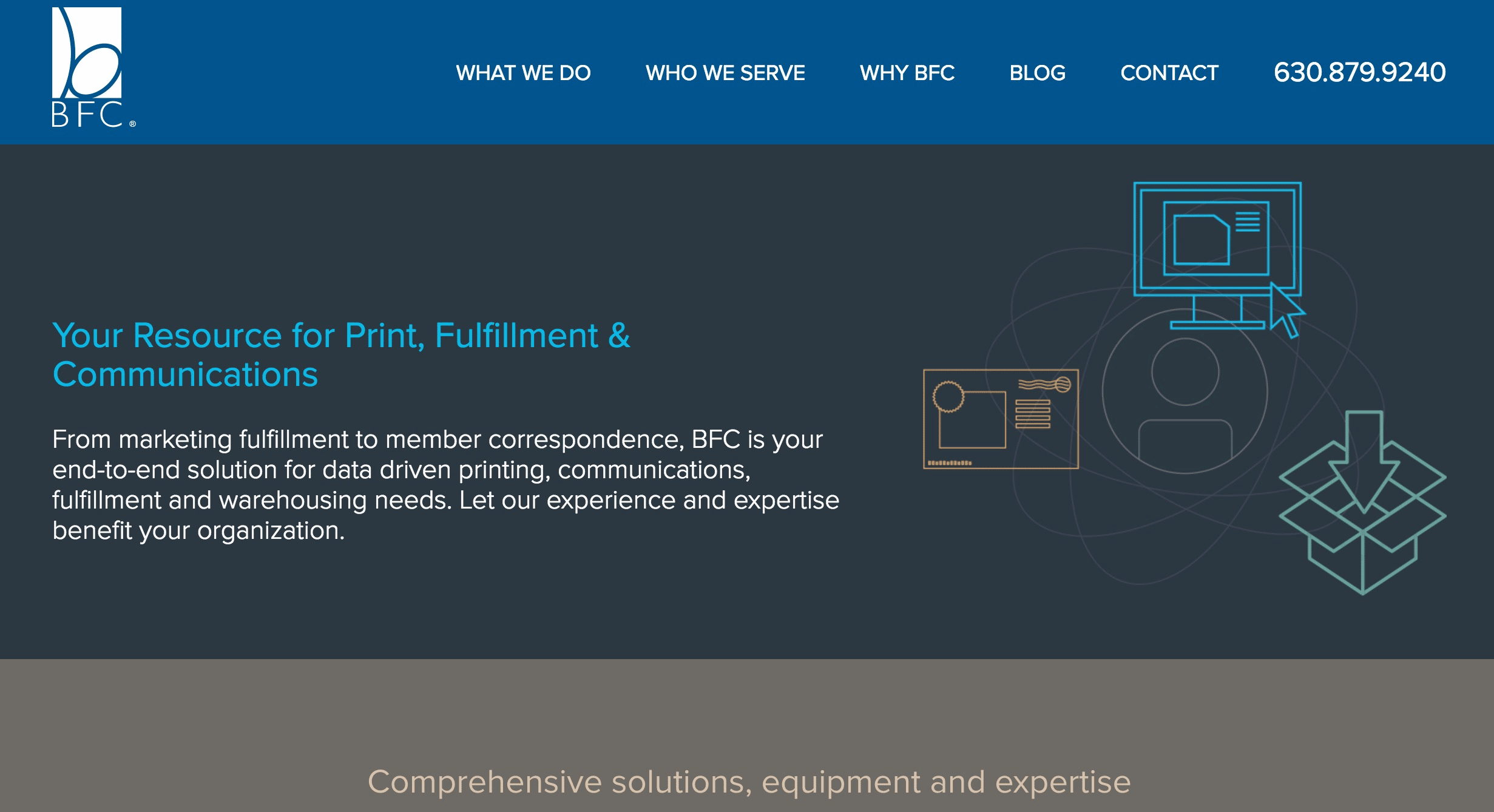
The BFC website, created by Simple Machines Marketing, does a great job of keeping things simple for visitors. The company offers an impressive and wide array of printing services that work with client-provided custom data fields; the website distills its content to simple, easy to understand information and navigation. With large navigation buttons and content on each page that focuses on the most need-to-know information, visitors are able to easily learn enough to decide if they’re ready to reach out to the company.
Thinking about re-designing your website? Let Simple Machines Marketing help – check out our Website Design Services today!
Final Thoughts
Don’t steer your website visitors the wrong way as they drive around your website. With clear navigation and relevant content (as proven by data, not hunches), your visitors will arrive at their destinations faster and easier – putting you closer to snagging a new lead.
Remember that the Internet isn’t a one-way street: if your visitors can’t find what they want on your website, they’ll make a U-turn back to Google and zip on over to another website that doesn’t turn into a dead end.