So, you’ve decided to add an email newsletter to your marketing strategy – great! Now it’s time to get down to business and put together a successful piece of content for your audience.
As you’re starting out, remember that your newsletter doesn’t have to look or read exactly like another company’s. An email from Apple will be drastically different than one from L.L. Bean or a local artisan. But even though these emails have varied content, design styles and templates, there are a few foundational elements that successful email newsletters share.
Let’s break down the four key components of a successful newsletter:
Engaging Subject Line
This one is a no-brainer, right? We’re guessing that you spend time cleaning up your inbox often and only clicking on subject lines that catch your eye.
But crafting the right subject line is more involved than it seems. It’s essential to consider what type of newsletter you’re sending, who your audience is and what action you’d like them to take.
When creating your subject line, consider the following things:
- Will your email be filtered out? Using words like “affordable,” “free,” “limited-time” or “cheap” can get your email sent straight to your audience’s junk folder.
- What’s your objective? Your subject line should reflect what you’re asking your audience to do in your newsletter.
- Is it personalized? You’ll want to be using segmented lists for your emails – that way, you can format your subject lines to speak directly to them and what they’re looking for from your newsletters. Pro tip: adding a first name tag is a quick and effective way to grab your audience’s attention.
As you’re formatting your subject lines, here are a few formulas to help inspire you:
- Ask a Question: “Need help crafting your newsletter?”
- How-To: “How to Create an Engaging Newsletter”
- Call-to-Action: “Get Started on Your Newsletter Today”
- Include Statistics: “72% of People Want to Read Your Newsletter”
By following these steps and formulas, you can create eye-catching, engaging subject lines that make your audience want to open your newsletter.
Valuable Content
The most crucial element inside your newsletter is the content you include. Sure, an engaging subject line has convinced your audience to open your email. But if you don’t deliver in your email, your audience will unsubscribe.
Your content should be personalized based on your company/industry, email segments and newsletter objective. But no matter the objective, your newsletter content should still be:
- Concise: Ask yourself how you can make your email copy clear, concise and easy-to-read. Drop the industry jargon or wordy intros and get to the point.
- Scannable: According to Campaign Monitor, 47% of people use a mobile app to read their emails. On a small screen, long paragraphs cause readers to lose interest. Break up your text for an easier mobile experience.
- Valuable: According to HubSpot, successful newsletters are 90% educational and 10% promotional. These numbers might change depending on your company goals, but overall your newsletter content should provide value to your reader. This could include breaking down trends, industry advice or company updates.
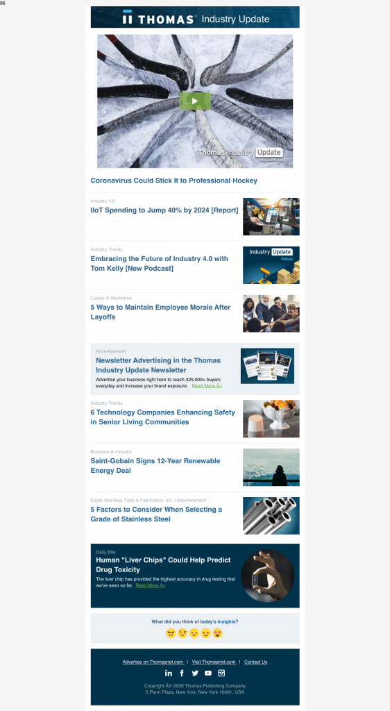
The Thomas industry newsletter offers a prominent piece of content right at the top. It then lists several scannable blog titles, with minimal copy to keep things brief. Thomas’ newsletter is meant to cover broader manufacturing updates, so you’ll see content from several different sectors.
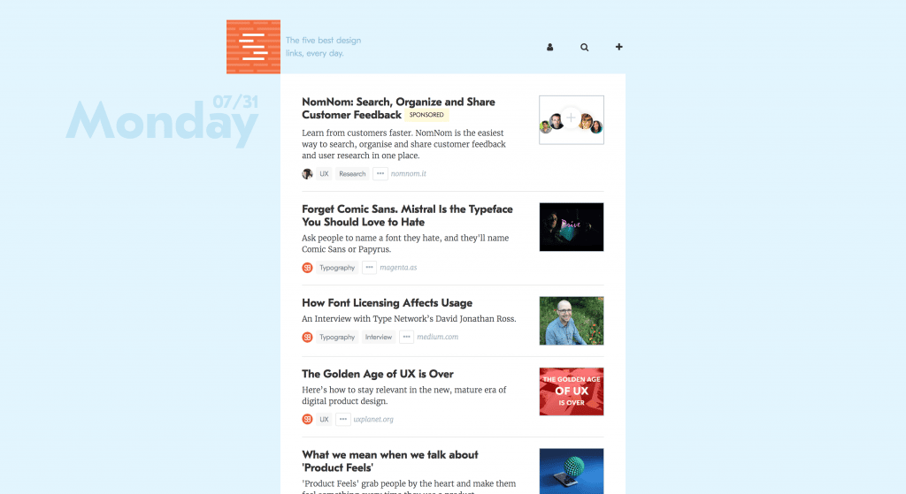
SIDEBAR’s email has a consistent format – five links from every email. This lets their audience know exactly what they can expect from every newsletter. Unlike the Thomas email, though, this one includes content solely focused on design and development, meaning it’s most likely being sent to a specific segment.
Impactful Design Choice
Your email’s design is a place to show off your company’s personality and set the tone for future newsletters. If you’re new to graphic design or email building, don’t worry – there are plenty of email platforms that will help you build a professional newsletter with user-friendly tools.
Once you have your company’s logo and color palette, platforms like HubSpot or Mailchimp will give you a choice of pre-made. While these assets are a necessary starting point, there’s more to an impactful newsletter design than just having your branding on the page. When creating a design template, you can show off your personality and find a format that meets your newsletter’s objective.
For example, ask yourself: Do you have a high-quality image or graphic that you’re looking to highlight each month? Are you looking for a clean, crisp email or a quirkier look to fit your company’s personality? Do you want to spotlight specific content downloads and links individually or quickly list your content right at the top? Experiment with the templates or designs until you find one that fits best.
As you’re formatting your email, keep these points in mind:
- Don’t feel like you need to rely solely on imagery. If you include graphics or images, balance them with text, so things don’t feel cluttered.
- Consider how the imagery you include reflects your industry and your company.
- Don’t underestimate the power of whitespace. Not every inch of your email needs to be filled with color, images or text. Whitespace can help keep your email clean and easy-to-read.
- Make sure you add alt-text to your email images. If your audience member has email images blocked or turned off by default, alt-text adds context to your images.
Of course, Airbnb included their signature company color (our team argued for a bit, but we decided that it’s salmon.) But they also chose several photos brimming with bright colors that fit nicely with their own palette. These images draw you in but don’t overwhelm you. There’s still a nice balance between graphic real estate and the amount of text. Plus, the use of whitespace makes the email feel crisp and clean.

Moz creates tools to measure SEO and website analytics. They’re data-driven, so it makes sense that their newsletter would be content heavy and have a clean, easy-to-read style. But even though their design is minimal, they’re still able to weave in their logo and company color palette without distracting from the main focus – the content.

Focus Your Call-to-Action
The last thing you want is to confuse your audience with your newsletter. It’s crucial to choose one call-to-action (CTA) for each email, making it clear what you’re asking your audience to do.
Even if you’re sharing multiple pieces of content with different CTAs (for example, a newsletter with several blog posts for your audience to read,) that doesn’t mean that each of those CTAs need to carry the same weight.
Start by picking one prominent CTA as the most important thing you’d like your audience to do.
Whether you’re using a large button or banner, your audience should be able to spot this CTA easily. It should be a simple path from your audience opening the email to them following your preferred call-to-action, without many distractions in between.
Of course, you’ll still want to link URLs and images to any additional pieces of content you’re sharing. But those should be seen as secondary items that don’t distract from your primary CTA.
AWAY relies on high-quality product photos while balancing text and whitespace. The image and text formatting leads the audience’s eye straight down to their ultimate CTA – “Shop Now.” Although “Shop Now” is the main CTA, the additional products featured throughout the body are linked as well, in case someone wants that one specific product.

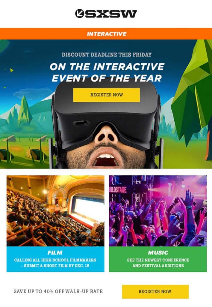
On the other hand, SXSW gets down to business. They’ve used bold imagery and colors to catch their audience’s attention and placed their CTA right at the top of their newsletter. The action they’re asking their audience to take is easy to understand – “Register Now.” While there are no prominent CTAs on the bottom images, they’re still linked to bring audience members to relevant website pages. But without any additional buttons, they’re not distracting from the ultimate CTA of “Register Now.”
You Can Do This!
Whether you’re shoring up your current newsletter or brand new to the process, it can be overwhelming to start. Remember that with the tools we’ve listed above, you already have the foundations of a thoughtful, valuable newsletter that will excite and engage your audience.
If you’re looking for someone to create and execute a newsletter strategy that will help your business grow, we can help! Contact us today to see how we can help, and don’t forget to sign up for our email newsletter at the top of this page to stay up-to-date with us.